Apple’s new Liquid Glass interface design brings transparency and blur effects to all Apple operating systems, but many users find it distracting or difficult to read. Here’s how to control its effects and make your interface more usable. Although the relevant Accessibility settings are quite similar across macOS, iOS, watchOS, and tvOS, I separate them because they offer different levels of utility in each. I have no experience with (or interest in) a Vision Pro, so I can’t comment on Liquid Glass in visionOS.
macOS 26
To help you get a feel for how the various settings affect the Mac interface, I’ve taken all the screenshots below with the same screen content. For a quick comparison, download the images and then use Quick Look to flip back and forth between any two to view the differences. Select one image in the Finder, press the Space bar, and then use the arrow keys to change the Finder selection to the other image.
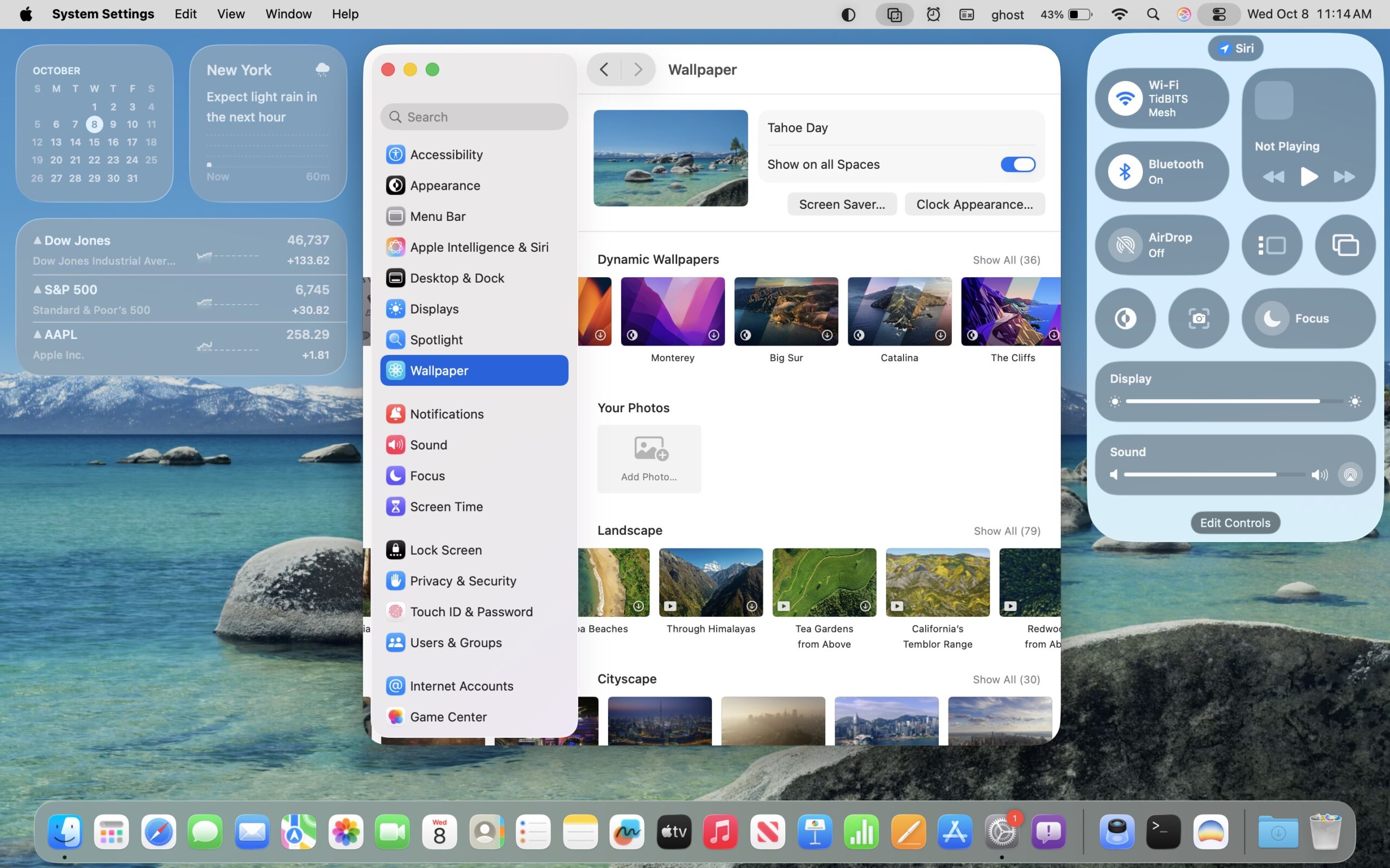
Default Settings
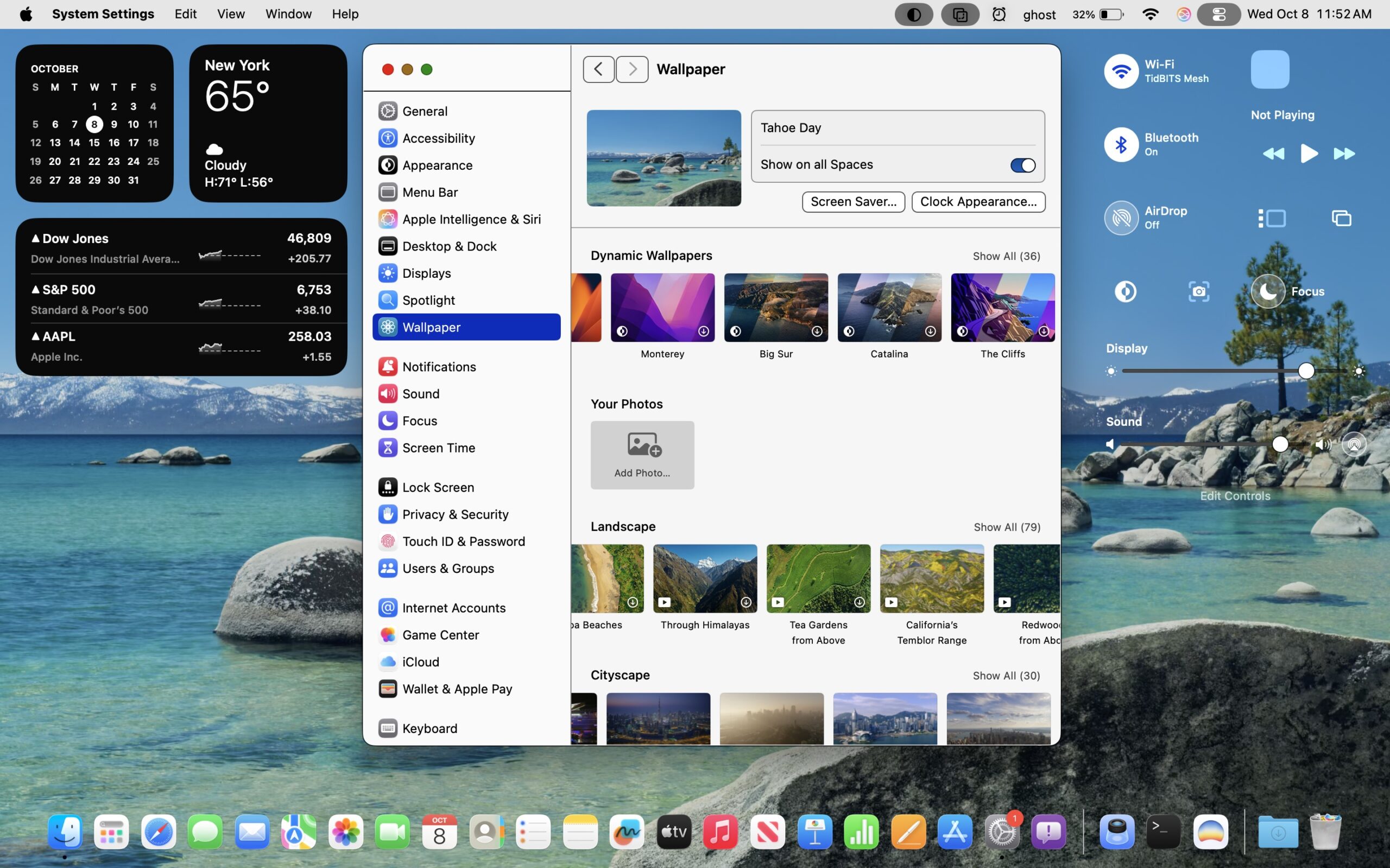
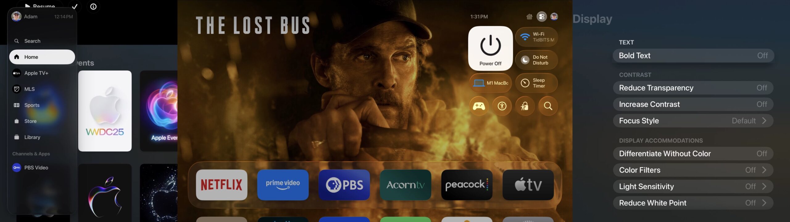
Here’s our starting point with macOS. Note the transparency in the menu bar, widgets, Control Center, and Dock. In the System Settings window, you can see that the sidebar is also translucent, allowing the wallpaper thumbnails to bleed through as they scroll underneath and letting the General item blur with Search at the top.
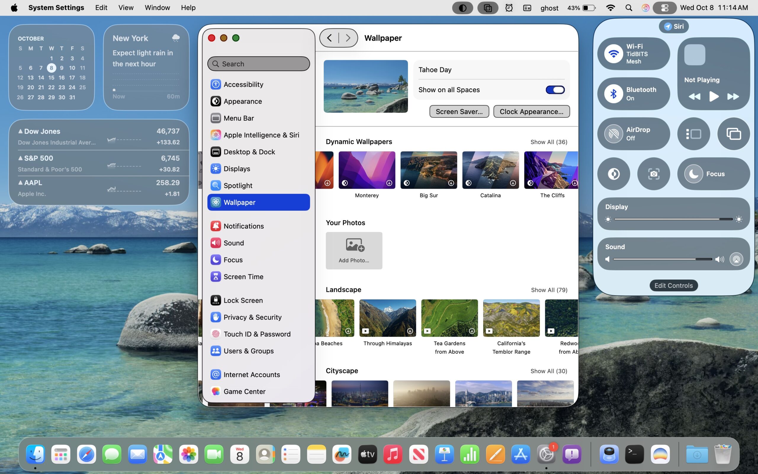
Reduce Transparency
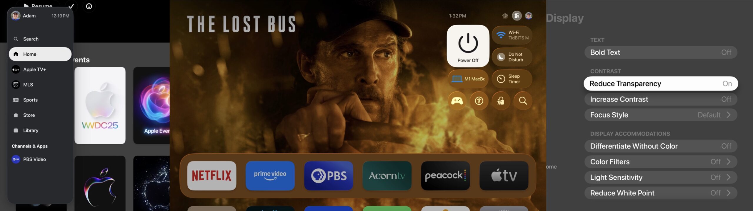
The setting that makes the most difference in toning down the excesses of Liquid Glass is System Settings > Accessibility > Display > Reduce Transparency. It turns the menu bar opaque, prevents the wallpaper from being visible through the widgets, Control Center, and Dock, and eliminates the awkward bleeds under the System Settings sidebar. For those who take a lot of screenshots, like I do, Reduce Transparency is essential because it ensures that all screenshots have a consistent background. It would be highly distracting if screenshots had noticeably different colors due to being taken over different wallpapers or windows.
Increase Contrast (and Reduce Transparency)
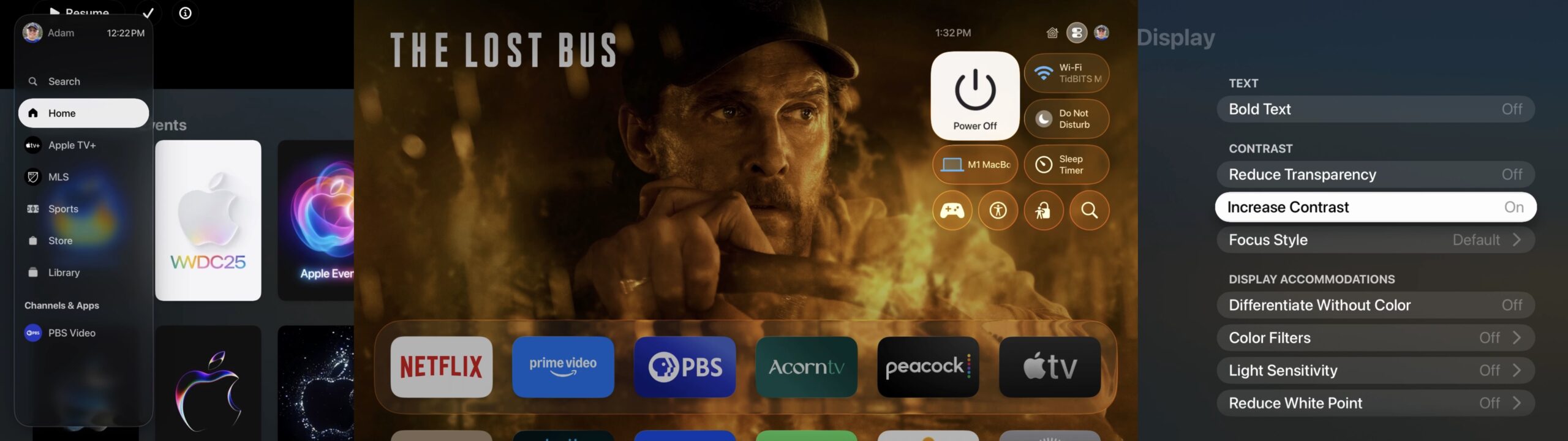
To further clarify the interface, you can turn on System Settings > Accessibility > Display > Increase Contrast, which also automatically enables Reduce Transparency. It outlines most interface elements so they stand out much more strongly—no more light gray on lighter gray. Note that it also changes some colors, so if you ever see a system that has odd blues and greens in Messages, for instance, it’s usually this setting. I find the Increase Contrast setting jarring, but it might be a significant help for those with low vision.
Liquid Glass Off
Recently, Bob Pony revealed on Bluesky that there’s a hidden setting in macOS that lets you turn off Liquid Glass entirely. Enter the command below into Terminal to turn off Liquid Glass; turn it back on by running the command again after changing YES to NO. You’ll need to log out and log back in to see the full effect.
defaults write -g com.apple.SwiftUI.DisableSolarium -bool YES
If you compare this screenshot to the first one, you can see that it eliminates the glass-like look of items in Control Center, drops the background around the Dock entirely, and reverts to the less-rounded corners familiar from macOS 15 Sequoia. The sidebar in System Settings is no longer on a layer above the rest of the window, and the Search field appears only at the top of the sidebar list, not as a hovering object that remains in view as you scroll the sidebar contents. You can’t see it in this screenshot, but the icon names that appear when you hover over them in the Dock also lose their background, becoming almost unreadable. Also not apparent from this screenshot is that all menus on the right side of the menu bar become almost entirely transparent and difficult to use—presumably they’re managed by Control Center.
Liquid Glass Off, Reduce Transparency On
What disabling Liquid Glass doesn’t do—reasonably enough—is turn off transparency. When I add Reduce Transparency to the screenshot above, here’s what I get. The menu bar becomes opaque, which is good, and widgets become black. However, Control Center is completely borked, and the change makes no difference for the Dock.
Liquid Glass Off, Reduce Transparency and Increase Contrast On
Adding Increase Contrast to the mix does what you expect but doesn’t improve any of the problematic spots.
I can’t recommend turning off Liquid Glass entirely in this way. Although it does make macOS 26 look more like macOS 15, it suffers from several glaring mistakes that Apple has no incentive to fix. Stick to Reduce Transparency and add Increase Contrast if your eyes would appreciate it.
Liquid Glass Off, Per App
However, as Matt Sephton noted in TidBITS Talk, you can also turn off Liquid Glass on a per-app basis, at least for some Apple apps. He gives these commands as examples, and you can experiment with other apps by replacing their bundle identifier—the com.apple.finder piece—in the command below. To find it, Control-click any app, choose Show Package Contents, and search Contents/Info.plist for the CFBundleIdentifier key. It’s usually sensible, like com.apple.Home.
defaults write com.apple.finder com.apple.SwiftUI.DisableSolarium -bool YES
defaults write com.apple.Preview com.apple.SwiftUI.DisableSolarium -bool YES
Reduce Motion
There is one other setting that’s often recommended for solidifying the interface: System Settings > Accessibility > Motion > Reduce Motion. On the Mac, the main place I see this changing things is in the zoom animation when entering full-screen mode—it becomes a cross-fade transition instead. Turn it on if you like, but don’t expect it to make a notable difference unless you have specific vision issues that call for it.
iOS 26
iOS has all the Accessibility settings macOS does and then some, plus Increase Contrast can be turned on separately from Reduce Transparency. For each of the screenshots below, the original image is on the left and a screenshot showing the effect of the setting is on the right. iPadOS is similar, as you’d expect.
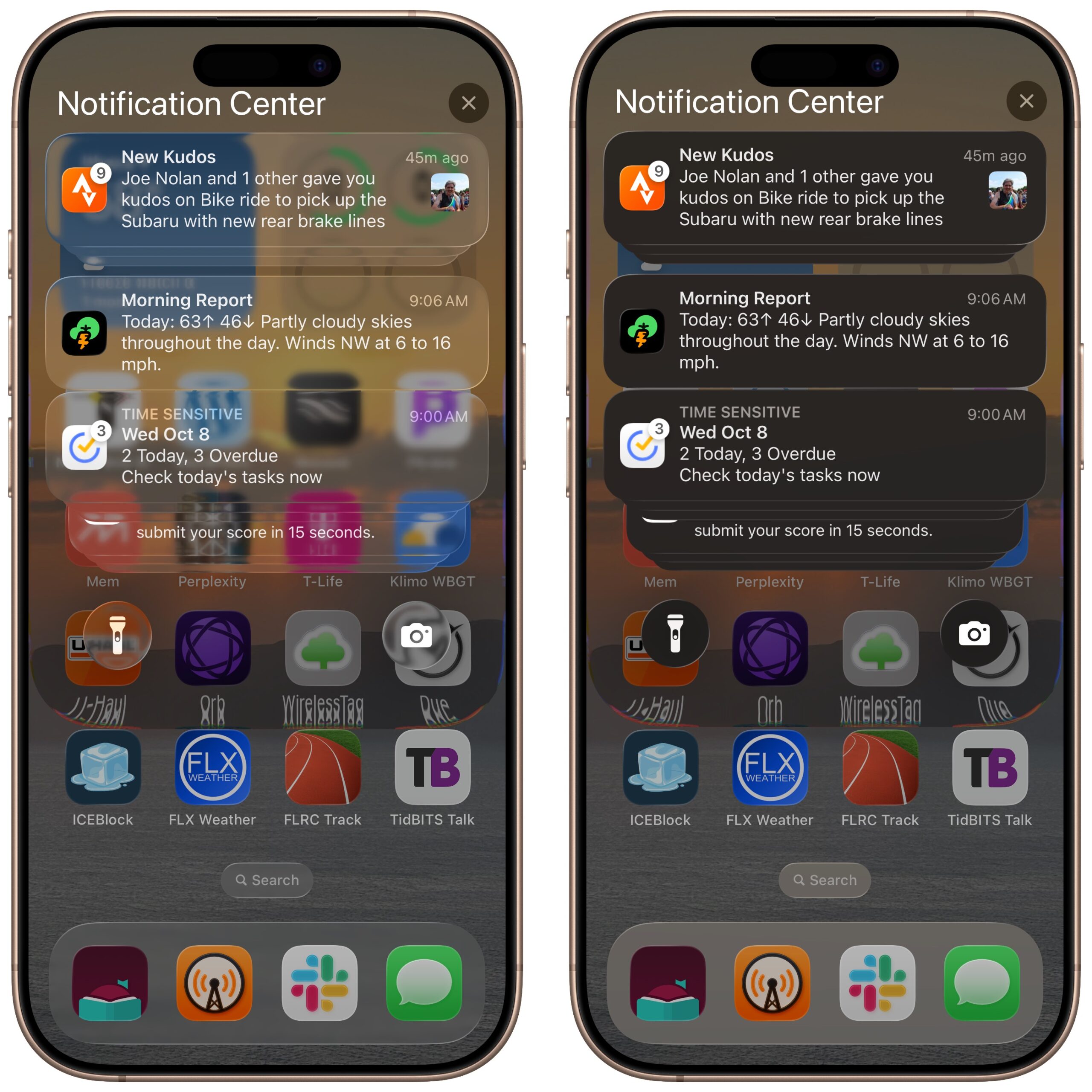
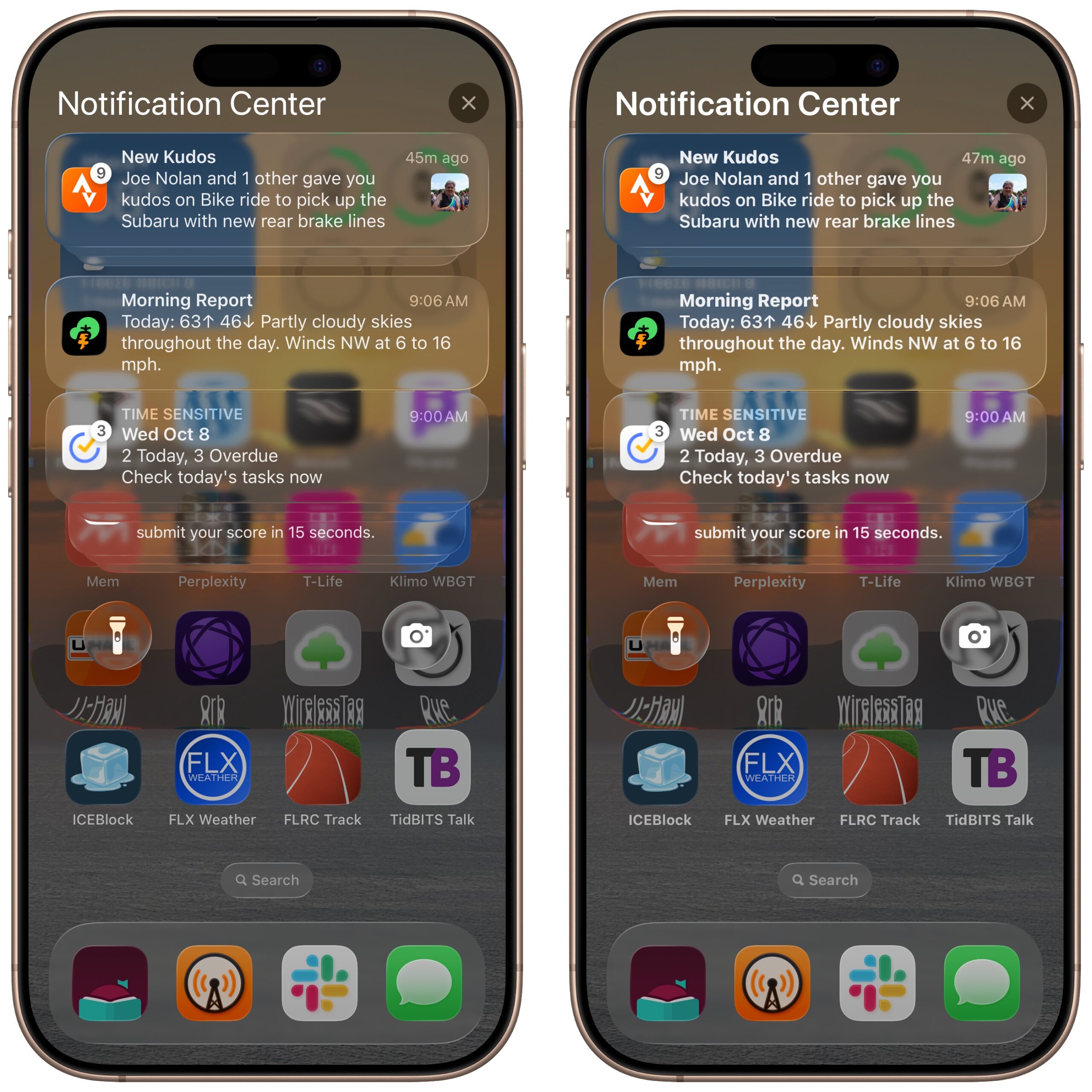
Reduce Transparency
I’ll start by turning on Settings > Accessibility > Display & Text Size > Reduce Transparency, which is again the most effective way to bring Liquid Glass to heel. As you can see, the big win is the notifications, which gain a solid background that makes them far more readable against the background. The Search button at the bottom also becomes opaque, as does the Dock’s border. The downside is that you’ll encounter some apps, such as Photos, where top or bottom toolbars have relatively few buttons and look strange because Apple expects the background to show through.
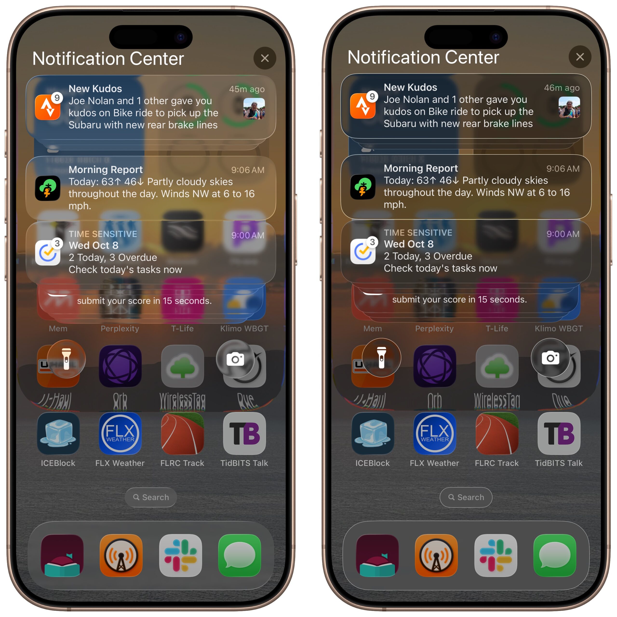
Increase Contrast
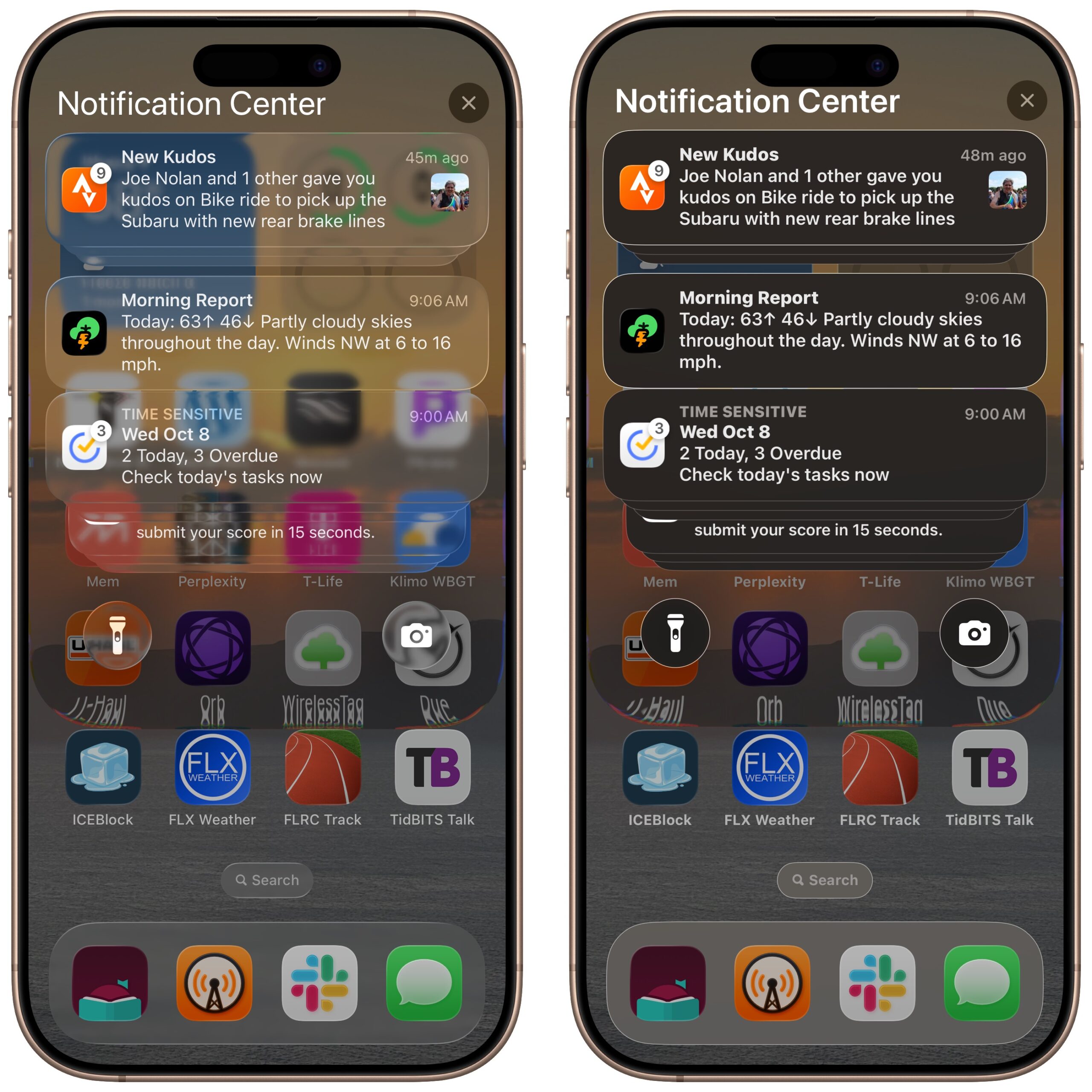
Turning Reduce Transparency off but enabling Settings > Accessibility > Display & Text Size > Increase Contrast offers an intermediate level of improved readability. The notifications are still see-through, but the extra contrast causes their text to stand out more. Increase Contrast applies solid borders to elements such as the notifications, flashlight and camera buttons, the Search button, and the Dock, helping to differentiate them from the background as well. Be warned that the blues and greens in Messages—and those used for switches through the interface—will look different from everyone else’s if you have Increase Contrast turned on.
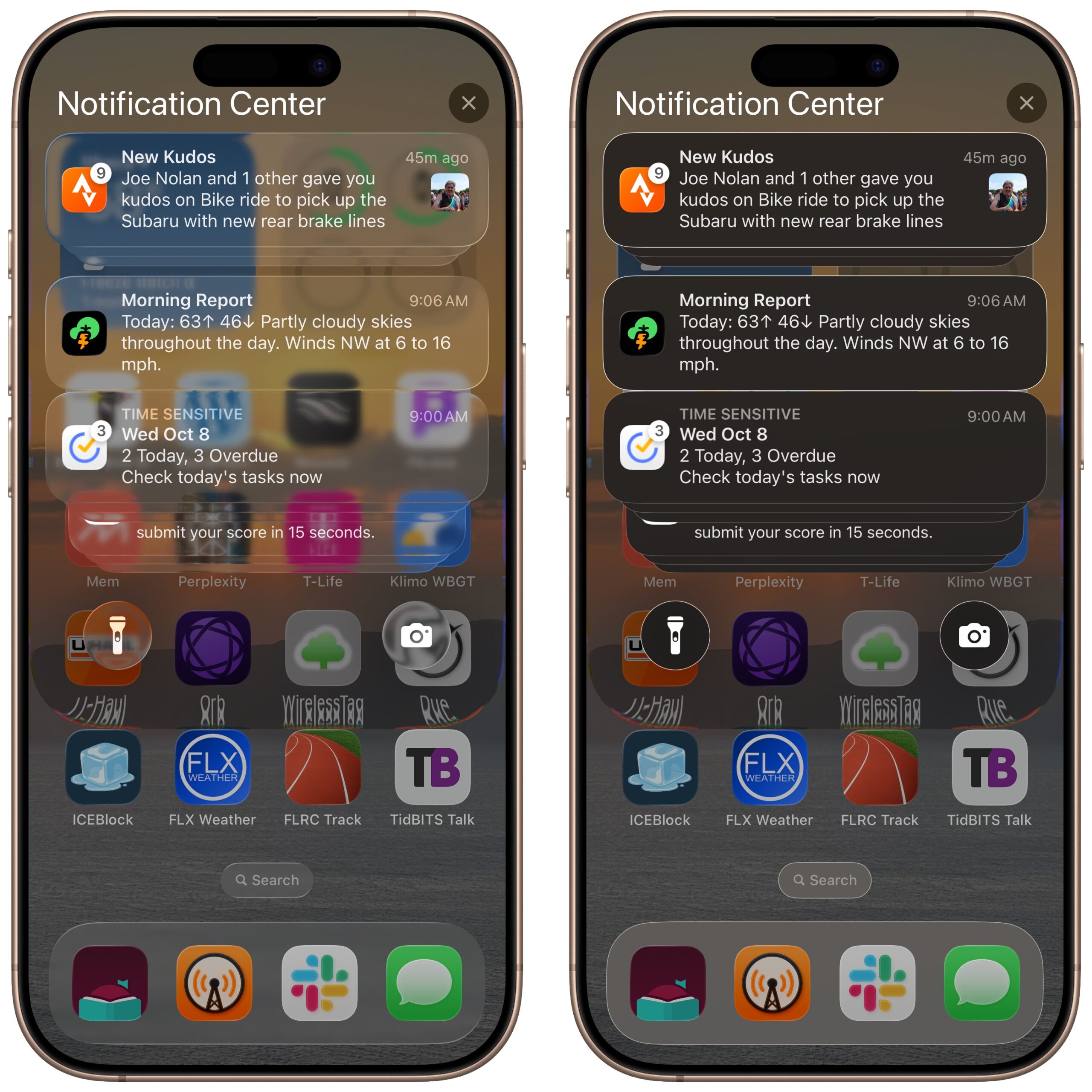
Reduce Transparency and Increase Contrast
What about combining the two? It does exactly what you’d expect, eliminating the bleedthrough of the background nearly everywhere, boosting the contrast, and adding borders.
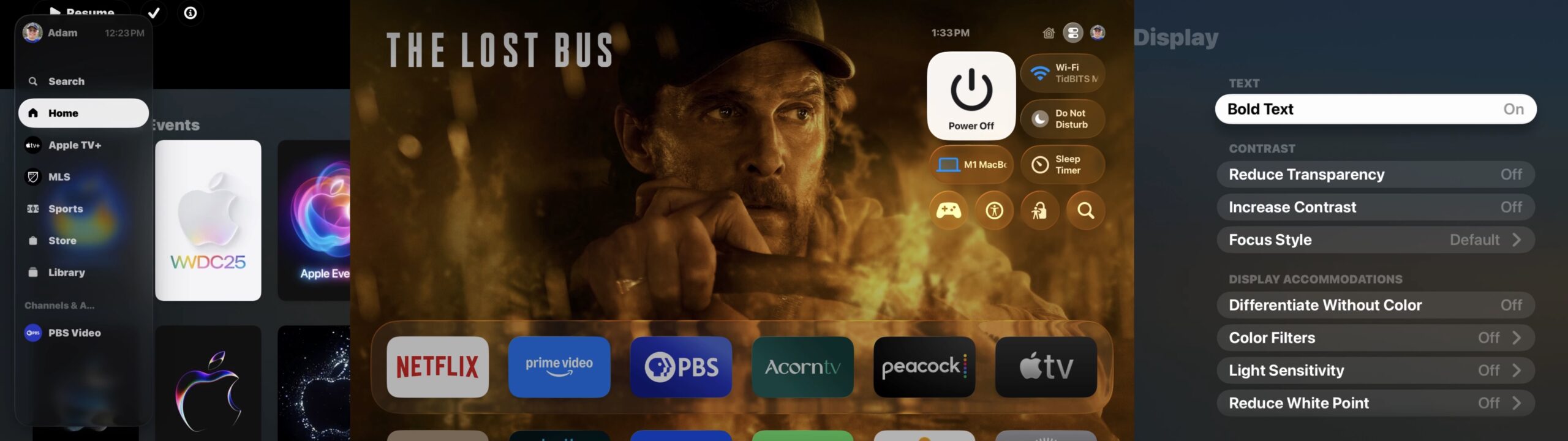
Bold Text
Perhaps the transparency doesn’t bother you, but you’re still having trouble reading text. You can try turning on Settings > Accessibility > Display & Text Size > Bold Text, which adds some weight to all text in the interface. (Happily, it doesn’t require restarting the iPhone anymore.) I think it helps, but not as much as either Reduce Transparency or Increase Contrast.
Reduce Transparency, Increase Contrast, and Bold Text
Since all these settings are independent, you can combine them for the ultimate in a non-transparent, highly readable interface. It’s more than I need, but there’s no shame if you like it best.
Reduce Motion
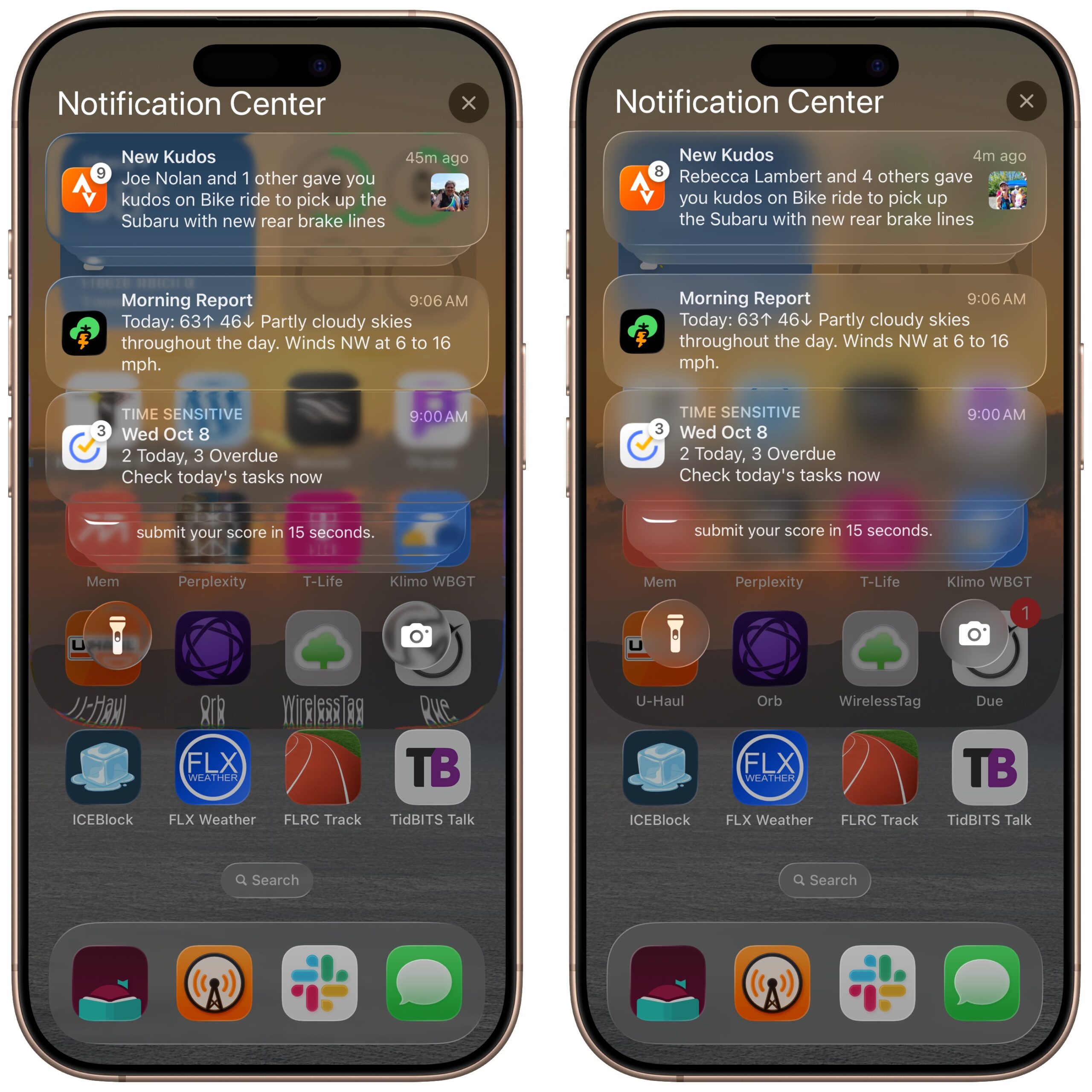
You may have noticed that Notification Center itself is a “pane of glass” with a curved edge that distorts the text above the bottom row of icons. That’s more annoying in static screenshots than in actual use, but you can eliminate refractions as well by turning on Settings > Accessibility > Motion > Reduce Motion. (While you’re there, test with Prefer Cross-Fade Transitions, too—I had trouble discerning what it did.) The right-hand screenshot below has only Reduce Motion turned on, but you can see that the edge of Notification Center’s pane no longer distorts the text under it, and it also makes the background noticeably blurrier. You can combine Reduce Motion with all the rest of the settings if you want. The downside of Reduce Motion is that some aspects of the iPhone and iPad experience may feel abrupt without their normal transitions.
Other Settings
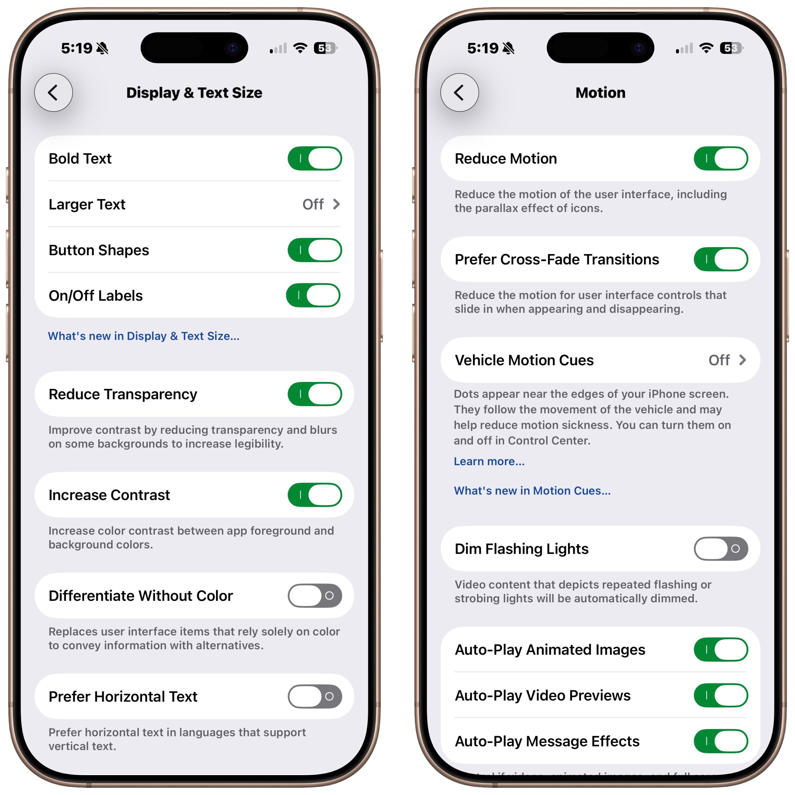
For reference, here are the Settings > Accessibility screens I’ve been discussing. A few additional settings here may enhance your experience with Liquid Glass and the iOS 26 interface in general. You can increase the text size with Larger Text, although at some point, certain parts of the interface may look weird. It can be tricky to find examples of what turning on Button Shapes will do, but more buttons that are normally just text will get outlines and possibly be underlined. Enabling On/Off Labels adds a vertical line (for on) or circle (for off) symbol to all switches if the color change doesn’t work for you.
watchOS 26
watchOS has the same Accessibility settings as iOS, and for the most part, they serve the same purpose. That said, the Apple Watch display is small enough that Apple was more restrained in how extensively it implemented Liquid Glass, so reducing the impact of Liquid Glass is less necessary.
The easiest way to test these settings is through the Accessibility screen in the iPhone’s Watch app—changes take effect immediately on your Apple Watch. They’re also available in Settings > Accessibility on the watch itself, but it’s much clumsier to work with.
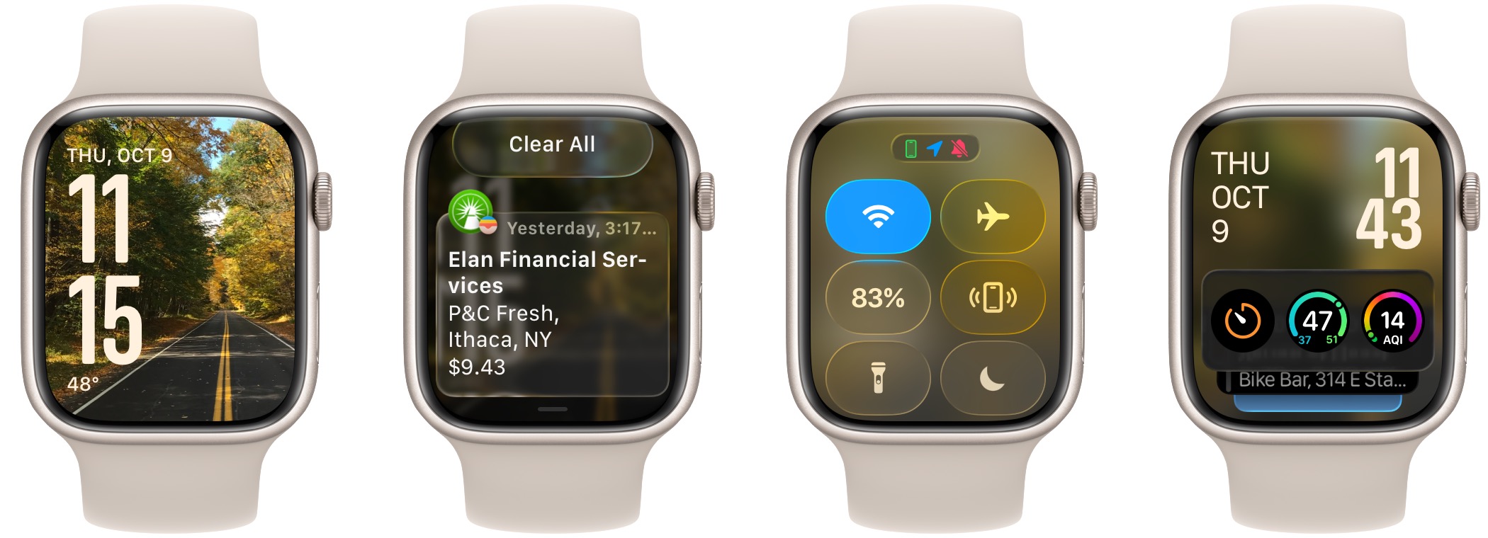
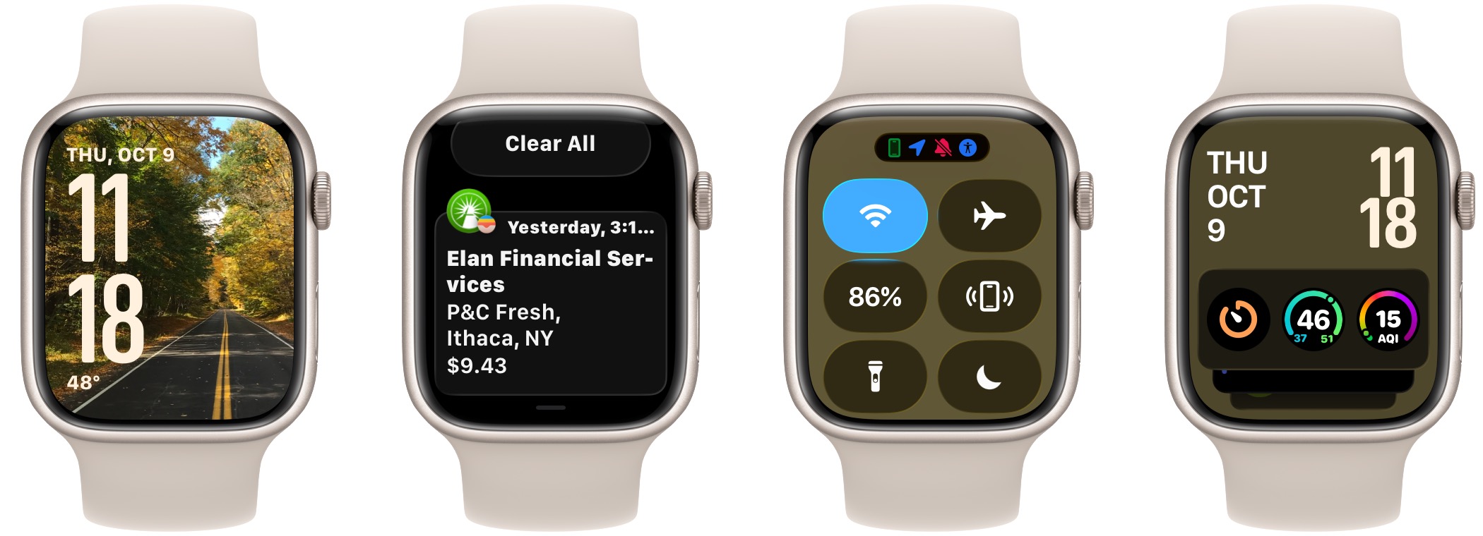
Default Settings
To set the stage, here’s what four screens of watchOS 26 look like with the Photos face. Obviously, what bleeds through the Liquid Glass will depend on your face; some faces work better than others. Nevertheless, you can see that the photo is fairly visible under the notification in the second image, and somewhat visible behind the Smart Stack in the fourth, but hardly noticeable behind Control Center in the third. (Ignore some of the numbers changing; it’s devilishly difficult to capture these screenshots precisely and in the desired sequence, so I had to retake a few.)
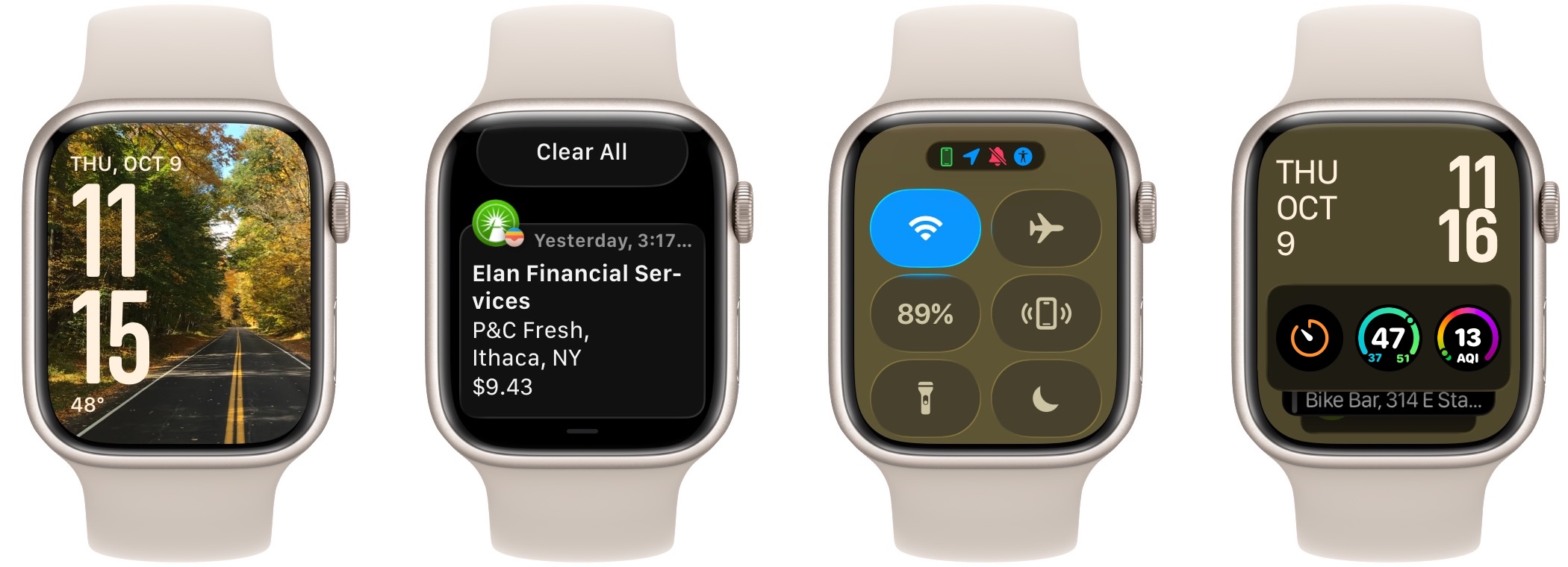
Reduce Transparency
Enabling the Reduce Transparency switch results in notable changes. The background disappears from all three screens with overlays. My take is that the notification text is much easier to read; the other screens aren’t markedly different in terms of readability.
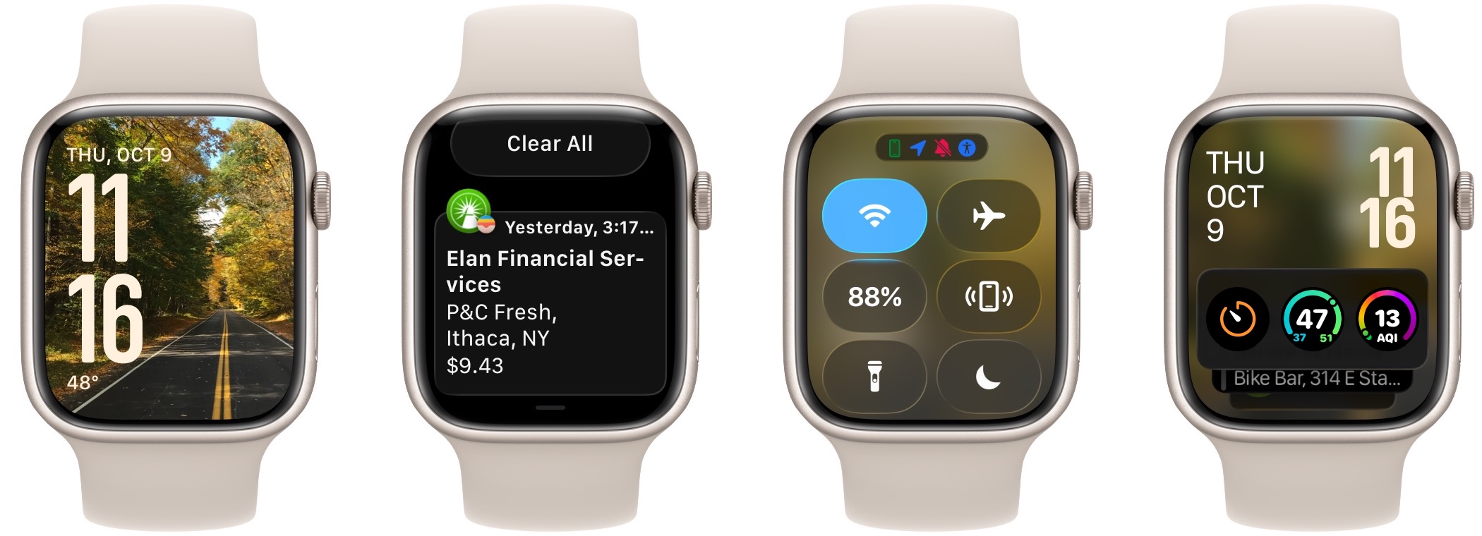
Increase Contrast
Swapping Reduce Transparency for Increase Contrast keeps the black background under Notification Center, but restores it to Control Center and the Smart Stack. Nonetheless, the icons in Control Center stand out noticeably better thanks to darker backgrounds and brighter whites. For my eyes, Increase Contrast offers the best combination of making aspects of the interface—notably the notifications—easier to read while still retaining some of the background for aesthetic reasons.
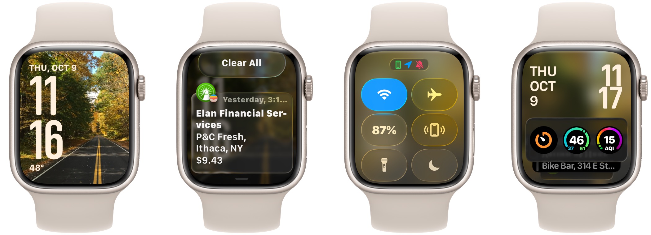
Bold Text
Perhaps the problem is simply the text being too thin? This test, with the Bold Text setting enabled, shows that making the text bold helps slightly, but the notification text remains harder to read against the image background. Bold Text appears to affect only the text in Control Center, not the icons, but it does bold the orange Timer icon in the Smart Stack. Notice that it also bolded the date and temperature on the initial screen. To my mind, Bold Text is not much of a win on its own.
Reduce Transparency, Increase Contrast, and Bold Text
As expected, combining all three settings yields the most readable interface in watchOS. Reduce Transparency eliminates the blurry backgrounds, Increase Contrast makes the buttons in Control Center pop, and Bold Text makes all the text a bit thicker and easier to parse.
Other Settings
As with iOS, a few other settings in the Accessibility screen may also be helpful. You can increase the text size throughout the interface using the Text Size slider, although setting it too large will significantly reduce the amount of information that fits on the screen and result in some awkward wrapping. There’s also a Reduce Motion switch, but I couldn’t figure out what effect it has.
tvOS
I’ll admit a distinct level of apathy when it comes to Liquid Glass in tvOS 26. Because tvOS is primarily about consuming content, and Apple has already put a lot of work into making it visually striking, the Liquid Glass changes don’t make much difference. That’s even more true in apps other than Apple’s TV app since they all do their own thing anyway.
To illustrate what you can control, I combined three screens that change based on the available Accessibility settings:
- Left: The TV app with its Liquid Glass sidebar
- Middle: The tvOS Home Screen showing an Apple TV+ movie under the Liquid Glass-enabled Top Shelf of icons and Control Center
- Right: The screen at Settings > Accessibility > Display, where these settings live.
Default Settings
In the default state, note that the Liquid Glass sidebar on the left side displays blurry images of the icons underneath it, and the Liquid Glass-driven Top Shelf features a movie poster background surrounding the icons. Similarly, the Control Center icons show the poster background. The Settings text is provided for reference—no Liquid Glass is involved.
Reduce Transparency
Turning on Reduce Transparency eliminates the bleedthrough of the background in the sidebar, Top Shelf, and Control Center, and it slightly lightens the color of the Settings screen. The readability of the sidebar does improve, but the icons in the Top Shelf and Control Center are equally readable in either state.
Increase Contrast
Increase Contrast has a minimal effect in tvOS. Most notably, it makes the headings above the controls in the Settings screen brighter. The time and the Channels & Apps headings also become a bit brighter. The outlines around the Top Shelf and Control Center icons also become more prominent. Ironically, making the headings look more like the controls and sidebar items reduces contrast.
Bold Text
I actively dislike Bold Text in tvOS. For my eyes, the text in tvOS is easy enough to read to start, and making it bold muddies it and makes it slightly harder to read in general. Nor do I think it helps readability in the Liquid Glass sidebar.
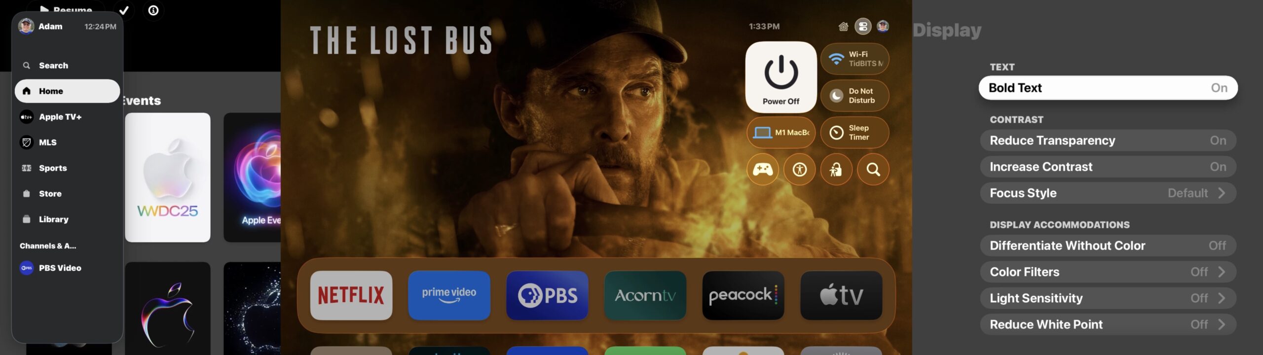
Reduce Transparency, Increase Contrast, and Bold Text
Putting all the settings together does what you’d expect, and if your eyes prefer it, that’s fine. Since I don’t like the Bold Text changes and Increase Contrast has such a minimal effect, I wouldn’t use these settings.
Reduce Motion
tvOS has an option at Settings > Accessibility > Motion > Reduce Motion, but as with watchOS, I couldn’t figure out what impact it has. However, I’m thrilled I found it because that screen also contains the option to turn off Auto-Play Video Previews, which I hate with the heat of a burning sun.
Recommendations
As I hope I’ve been clear throughout, everyone’s vision is different, and you should choose the settings that make these various interfaces the most usable for you. If you’re looking for a starting point, here’s what I’ve done.
- macOS 26: Use Reduce Transparency to bring back the opaque menu bar and eliminate odd bleedthroughs in various parts of the interface. This setting is particularly important if you take screenshots for documentation.
- iOS 26 and iPadOS 26: If you can read notifications and don’t have trouble with readability in other apps, I recommend leaving all the settings off to start and only turning on Reduce Transparency if you decide you need it. It significantly improves readability, but at the cost of awkward interfaces in some apps that heavily rely on Liquid Glass elements.
- watchOS 26: My favorite setting for watchOS is Increase Contrast, which makes notifications more readable by eliminating the bleedthrough background and also causes some buttons in the interface to stand out more. Reduce Transparency isn’t much of a win and makes the interface less attractive.
- tvOS: I don’t see enough benefit in any of the settings that reduce Liquid Glass to bother with them. Reduce Transparency works as expected, but there’s relatively little transparency used, so it makes little real-world difference. But turning off Auto-Play Video Previews is a huge relief!
Let me leave with one final reminder. Liquid Glass is here to stay. Apple will continue to refine it in small ways throughout the rest of the OS 26 cycle, but there’s no avoiding it. Nor is it the worst thing ever—it won’t radically affect the Apple experience for most people, and with the judicious use of the Accessibility settings I’ve described here, you can reduce the impact of any changes that do make it harder for you to interact with your devices.