My gut reaction is that I like it, but it is not perfect.
It is not even great.
It is, however, a good step in the right direction as CCP attempts to re-craft the in-game map to do what a map is supposed to do, and that is to provide information to the user in a clear and manner.
A map is not a location, it is a representation of a location meant to communicate specific information about that location. The original in-game map, love it though I might… and I hope they never remove it… mostly communicated that New Eden was a big and complicated place.
My personal map of New Eden
That map is so cool and very impressive when you show it to somebody who has never played the game. But it is a literal, 3D representation of New Eden… and the stars in the game aren’t all nicely aligned, and the star gates don’t always connect to the nearest star, and the connections cross each other, and while you can decipher it, there are times when one has to zoom in and stare at the map a bit to figure out which systems are actually connected by gates.
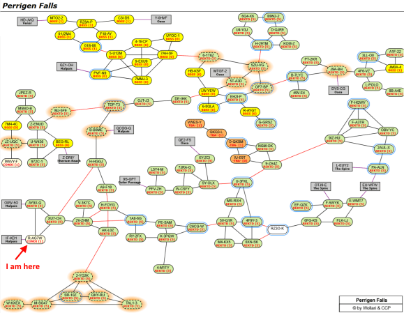
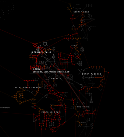
The old map with me in Perrigen Falls
And when one zooms our to, say, try and display the Drone regions, the muddle continues.
The Drone regions all mixed up
Now, that is an accurate representation of the Drones. Don’t get me wrong on that point, it is a muddle of overlapping stars. When trying to represent New Eden in a tool like GARPA, which put some work into a more logical layout, things still collide.
The Drone Regions
That is more clear than the in-game map, but still a representation of its literal distribution, just flattened and a little easier to read.
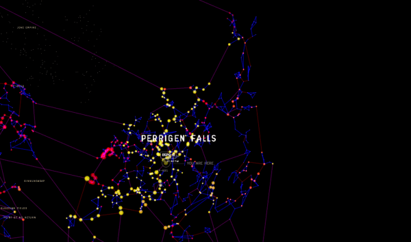
And even over on DOTLAN EVE Maps, beloved site of the community (go make a donation), where you look at maps in region-sized chunks by default, you can get a sense of how intertwined the Drone regions are.
DOTLAN presents – Perrigen Falls!
All those gray boxes represent connections to other regions. There are 14 of them and they connect to 6 different regions, including a region gate to Venal.
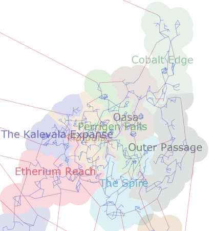
Given all that, I am pretty happy with how the new map has chosen to represent the Drone regions.
The Catalyst 2D Map of The Drones
As a side note, I have one of my favorite overlays set on both the old and new map, which is how many times I have visited a particular system. I find that interesting in a nerdy sort of way as it is a bit of a history of my interaction with the game.
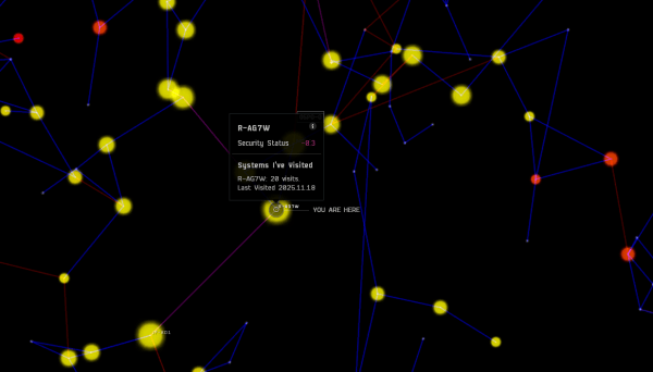
When I zoom in to duplicate that first map image I included, zoomed in on my location, this is how it looks on the new map.
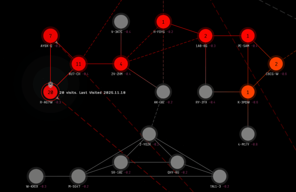
New Map – How many times have I visited R-A?
That is much cleared to me as a user than the old map. It also shows me, if I zoom in sufficiently, the count for the selected systems as well as nearby systems.
And if I want to visit a few of those nearby systems where I have never been, mousing over them tells me how many jumps it take to get there. Then I can right click on a system and see the path to get there.
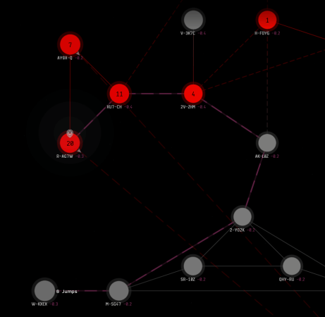
The path to exploration
Granted, you could also right click on systems and set destination with the old map, but here it is a lot more clear what you’re clicking on and the route. (The line is also a “marching ants” moving line, making it more visible, something not obvious in a still image.)
All the overlays available with the old map are offered with the new map, so you can see recent kills or system jumps or how many people are docked up in Jita.
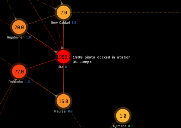
Plenty of people docked up in Jita
My primary use for the in-game map over the years is to find out where my fellow fleet members are if I join late or have to step away during an operation. At this the new map is objectively better than the old one. The old one just highlighted systems where there was ANY fleet member, and with scouts, stragglers, and lost sheep like myself, you can end up with dots spread out and you have to find and mouse over each one to see how many people from the fleet are in a given location.
The new map gives you the count on the system circle.
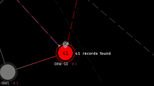
Dude, where’s my fleet?
If you mouse over it will give you a partial list of names. That “41 records found” is probably the result they logged when testing and might not be the best message. Still, it is better than LOTRO, which used to give you the “action completed successfully” message for some operations. (Does it still do that? I can’t remember.)
The unifying message of all of this is one of greater simplicity and clarity. This is a good thing. One does not need a USGS topographical map to get to the grocery store, a simple street map will do. There are may great maps in the world that communicate information using an abstract, logical approach rather than a detailed literal representation. The London Underground map is often held up as a prime example of such, though the maps for the New York subway, and even our own Bay Area Rapid Transit map, also use such a level of abstraction to clearly communicate what the customer/rider needs to know.
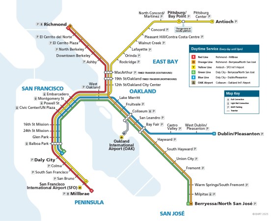
The Current BART Map
No rail lines every run so straight. Also, there are not 2-4 parallel tracks save at a couple strategic points. The whole system is generally a pair of tracks with sidings and switches to get trains to the right destination.
(That is also a very early 1960s view of reality, where San Francisco and Oakland were the core and San Jose was mostly farmland. The farmers voted “no” on BART. Now SJ has a bigger population than either city. But I digress.)
Anyway, great work so far.
But why am I only giving it a “good” or even an “incomplete” grade?
Well, to start with, there are a bunch of little nitpicks. For example, do I need a decimal place for players docked up as with that Jita map above? Will there ever be a fraction of a player? Maybe let’s just round to the nearest integer.
There are lots of little things like that to smooth over.
But more so, as noted above, I have a 19 year habit of not using the in-game map save for seeing where I have been, seeing where my fleet is, and metaliminal storms now and then. So while it does all sorts of things in a better, more visible format I automatically go to other sources for nearly everything else… even the metaliminal storm thing, because Signal Cartel keeps track of that.
And that goes double for moving anything with a jump drive. There never was any real facility for that in the old map, and that lack of utility carried over to the new. I did see somebody on Reddit complain about the new map by saying that they could visually estimate jump ranges on the old map. Good on you mate! But for the less apt players like myself, I am going straight to DOTLAN or GARPA or whatever to get jump ranges and fuel usage and to check alternate routes and mids.
There is nothing in the in-game map, new or old, that really does what these other maps do on those fronts.
But that is to be expected. And I don’t necessarily want to replace DOTLAN or GARPA. So I do think CCP has some distance to go to make the in-game map a useful resource for players… especially new players, and I wouldn’t mind at all if they focused on that first… in a way that gets me to not simply tab out of the game to look elsewhere.
Still, I commend the effort and look forward to future developments for the in-game map.
And until it gets further along there are always those five other maps (actually eleven, because fifth place was a multi-way tie) I wrote about a couple years back that offered up more than the in-game map… and probably still do so today.
Addenda: I forgot a couple points. I do like that the new map is in its own window that can be resized, so you can have other stuff on screen with it. That is very useful with a big monitor like mine. I am, however, sad to see it lacks the solar system view, which the one aspect of the old map I probably used the most in order to plot out points for safe spots and such.