Function is the floor, not the ceiling. It’s time to raise the bar and prove that the most viable products are the ones that feel human.
AI is now omnipresent in our workflows, but it's come at a cost: a sea of sameness. Lately, products have begun to look and feel homogeneous & indistinguishable, leading to diluted brands and increasingly sterile interactions. Big tech paves the way for others to follow; It’s time to stop settling for “good enough” and blindly following established conventions. Let’s continue to solve user problems and challenge the attitudes of an MVP (Minimum Viable Product) through the use of craft.
As explored in a recent New York Times interactive, an LLM’s output is tethered to its training data, revealing a fundamental limitation we must be aware of: AI is a master of regurgitation, not revelation. By drawing from a finite pool of existing designs, these models produce an exponential volume of garbled content — similar to a game of Chinese Whispers where the quality of the message degrades with every time it is retold. While these outputs meet functional requirements, they lack the distinct emotional character and style typically derived from an organic human-design process, required to stand out in a crowded marketplace.
In this article, I address a growing concern regarding the current state of MVP delivery in consumer products. We stand at a precarious intersection: the pressure to ship fast is colliding with a rising tide of generic AI outputs. We must dissect how designers can retain their creative edge in this environment and empower them to push back against stakeholders for the product's success. The challenge before us is not just to learn how to use new tools, but to continue to push past what’s been done before and continuously set new standards for the products we ship.
And so, we need to continue to elevate our craft. We must move beyond the basic utility of the MVP and change our attitudes on experiential standards — creating work that proves, unequivocally, that there is a human behind the design of every screen.
As popularised by Maya Angelou, American poet and civil rights activist:
“At the end of the day, people won’t remember what you said or did; they will remember how you made them feel.”
While Angelou may have popularised the sentiment later, Buehner is the earliest recorded source.

The common misconception of MVPs
The MVP, popularised by Eric Ries in Lean Startup (2011), is often viewed as a functional baseline; it is a stripped-back product intended to prove viability today, with the future promise of augmentation reserved for tomorrow (subject to demand, resources & budget — to name a few!) While many MVPs successfully meet basic user needs, they often fail to deliver a unique or engaging experience. This ordinary quality makes them bland and easily imitated by competitors, making it difficult for a brand to stand out and become compelling.
To understand the gap between function and value, consider a parallel from the physical world: the newly constructed house. At its core, a new build fulfils a functional requirement, providing essential shelter and space. Yet, without personalisation and decoration, it remains a generic structure, a standard configuration of walls and windows that is often repeated worldwide; We’ve seen it all before. It is a commodity, not a destination.
A house only becomes truly desirable when it transcends its utility. It requires the texture of life: the specific choice of paint, the curated furniture, and the family photos on the mantle. Without these personal touches, the structure creates no emotional resonance. It lacks the essential ingredients that transform a house into a home.
In product design, as in architecture, the structure is merely the canvas. It’s not until you apply a layer of craft that the screen turns from a habitable space into a valuable one.
And so, product teams must go beyond just a bare-bones MVP and strive for something desirable. This means crafting a superior user experience unlike other products that meet & surpass a user’s needs & expectations. This approach is crucial for gaining a competitive advantage and establishing a strong, lasting connection with your customers.

We need to change our attitudes toward MVPs
The real issue, in my opinion, however, isn’t solved by a new acronym (something the tech industry already has plenty of!) [MLP — Minimum Loveable Product]. The issue is that we often fail to build truly viable MVPs from the start. Henrik Ståhl’s article, Minimal Viable Whatever, earlier this year, made me question my work when throwing about the acronym “MVP”.
How do we know that the minimum thing we’re doing is viable enough?
A consumer product, put simply, cannot be viable (from a business perspective) without a strong brand voice and a delightful customer experience. To further the house metaphor, a family is unlikely to have bought the house in the first place if all the inner services of the building were exposed & its walls laid bare. Typically, a property developer would furnish the space to give it the best chance of a sale and further enhance their ROI. And so, maybe the issue lies with companies shipping half-baked MVPs in a need to generate revenue.
Building an enjoyable and satisfying product shouldn’t be seen as an additional arduous task to be deferred until after the delivery of an MVP. It’s too late by then; users will have already formed an opinion about the product & the wider brand. It’s hard to change someone’s first impressions. Similar to property developers, tech companies would likely achieve a greater return on investment if they were to delay launch until version one of their product was “finished.”

What do I mean by delightful experiences?
If “craft” has established itself as the defining design buzzword in 2024–2025 in light of AI assurgence, then “delight” is its emotional predecessor — and perhaps its most crucial outcome. While the two concepts are deeply intertwined, distinguishing them helps us understand what actually elevates a product from “good” to “beloved.”
To understand delight, we have to look past the code and the pixels. When done well, delight is the bridge that takes a user interaction beyond the baseline requirements of functionality and usability. As UX researcher Marc Hassenzahl notes, true delight isn’t found in the product’s surface features, but in its ability to satisfy ‘Hedonic’ needs — such as competence and stimulation — while seamlessly handling and optimising ‘Pragmatic’ tasks like time efficiencies.
What delights us as Humans?
Why do some tools make us feel empowered while others leave us drained? As psychologists Edward Deci and Richard Ryan demonstrated through Self-Determination Theory, our most meaningful experiences are rooted in how well a tool supports our human needs. They identified three essential drivers that must be met for us to feel truly motivated and ‘delighted’ by an experience:
- Autonomy: The need to feel in control of one’s own actions and choices.
- Competence: The need to feel effective, capable, and “smart” while performing a task.
- Relatedness: The need to feel connected to others or valued within a community.
In the words of Shipra Kayan in Delight is not cute flourishes:
Moments of delight can only happen when products help people be smarter, feel fulfilled, and avoid mundane tasks.
We must stop equating delight with cute decorative florishes. Real delight is the quiet satisfaction of a tool that anticipates and fulfils a user’s needs.
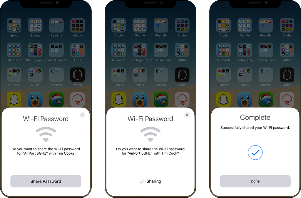
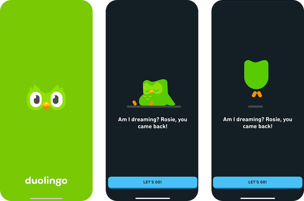
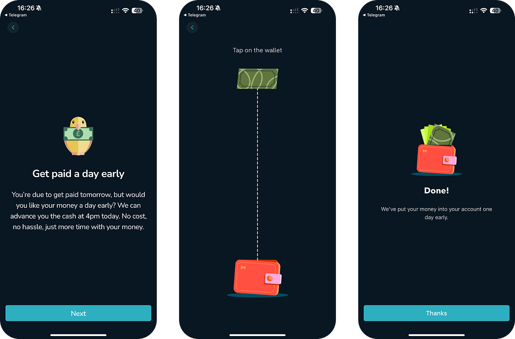
Here are some nice examples I’ve come across:
- Apple: Helping users when they’re not expecting it

2. Duolingo — Welcome back message

3. Monzo — Get paid early

What delight is not…
To understand the value of delight, we must first dismantle the misconceptions that have diluted its meaning. There is a tendency in product design to treat delight as the “cherry on top” — the final step to be taken only if the budget and resourcing permit.
It is not decoration. Delight is not an expensive afterthought or a superficial layer of polish applied to a finished product. Single UI alone cannot mask a poor experience. If the core functionality is broken, no amount of charming illustrations or witty copy can save it. In fact, applying “delight” to a screen in a frustrating user flow often feels more patronising than enjoyable.
It is not a gimmick. True delight is not merely a fleeting “wow” moment. Flashy animations or unexpected interactions that are disconnected from the user’s core needs are distractions, not delight. If an interaction dazzles the user but ultimately slows them down or confuses their progress, it has failed.
It is not a checkbox. Perhaps most importantly, delight is not a line item on a product roadmap to be marked “done” and forgotten. It cannot be treated as an optional extra, dependent on whether the team has leftover capacity.
Instead, real delight is the result of a holistic and intentional approach. It is woven into the product's architecture from day one, demonstrating that the designers respect the user’s time, intelligence, and emotional state.
Delight only works when basic expectations are met
Abraham Maslow’s hierarchy of needs taught us that basic needs act as a gateway to higher motivations (love, self-esteem, and creativity). Our basic survival needs must be met before any higher motivations can influence behaviour. Put simply, you don’t worry about “creativity” when you’re worried about finding your next meal.
Product development requires the same discipline. We must ruthlessly prioritise utility first. Until the software runs without bugs and the core problem is solved, emotional design is merely decoration. You cannot charm a user who is struggling to log in…!
This brings us to the crux of the issue: In an era where AI tools are democratizing development and efficiency, utility is no longer a differentiator — it is a commodity. When any competitor can use an LLM to generate functional code or optimise a workflow, simply “working error-free” becomes the bare minimum requirement for entry. To build a product that is not only commercially viable but truly “sticky,” utility alone is not a competitive advantage — it’s just the baseline. To create a commercially viable product, teams must move beyond a product that works to a product that feels right. This is where design craft will continue to be a product differentiator.

Delight vs User Satisfaction
Delight and user satisfaction are not the same thing. While both are positive outcomes in user experience, they represent different levels of emotional engagement.
User satisfaction refers to a user’s contentment with a product or service. It’s the feeling of having their needs met by achieving something or having a want met. A user is satisfied when a product works as expected, is easy to use, and fulfils its intended purpose. This is the non-negotiable prerequisite for quality.
Delight goes a step further. It’s an emotional response that exceeds a user’s expectations. Delight is the feeling of great pleasure, joy, or even awe that comes from an interaction with a product or service. It’s what transforms a good experience into a great one. For example, a user is satisfied when a mobile banking app processes a transaction quickly. They are delighted when the app congratulates them on their first successful deposit with a celebratory animation.
Frequency plays a pivotal role in this distinction. “Think of delight as a crescendo — a powerful, high-impact climax to an experience. However, not every click and interaction in a user flow is going to generate excitement. And that’s ok, otherwise the experience would be overstimulating and just irritating. User satisfaction, on the other hand, operates differently: it may offer a lower perceived value in the moment, but it sustains the product experience through a steady, reliable rhythm.

That’s great and all but how can we put this theory into practice…?

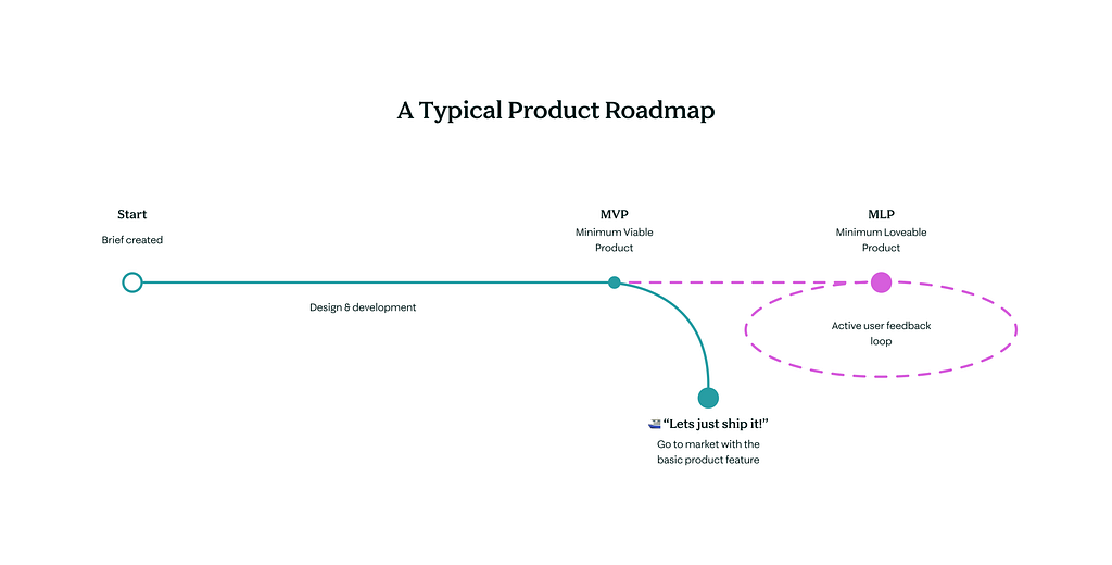
Delight is not at the end of a product roadmap
Delight should not be viewed as a nice-to-have garnish or a static end destination, as illustrated above — It’s a Foundation. To treat design as a purely functional ‘Point A to Point B’ exercise is like approaching a first date with zero personality or charisma. You may have technically shown up, but nobody builds a relationship devoid of emotion. Would you expect a second date? Absolutely not — and products are no different. When we strip away emotion, we strip away the incentive to return. Crucially, if that first encounter is defined by generic experiences that are indifferent, you aren’t getting a second chance. First impressions are notoriously difficult to rewrite, which is why deferring ‘personality’ until after the MVP is a strategic oversight. By then, the user has already judged the brand; if you didn’t delight them at the start, you’ve likely lost them for good.
Brands that create emotional experiences with their audiences are the most commercially viable (The proof is in the previous example: Apple, Monzo, and Duolingo have already set the gold standard for this approach). While often relegated to the ‘nice-to-have’ category, designing for delight represents a significant, untapped lever for product performance. Far from being an aesthetic indulgence, designing for delight is a high-impact lever for product performance. It drives the metrics that matter most: long-term retention, stickiness, and Lifetime Value (LTV). Moreover, it turns users into a self-sustaining marketing engine, slashing customer acquisition costs (CAC) through natural, fan-led referrals. In this light, delight is a key component of “viability.” When build resources are tight, emotional resonance shouldn’t be the first thing we descope — it should be the reason we build in the first place.

Let’s build desirable MVPs
Successful product teams enhance a Minimum Viable Product (MVP) by focusing on a continuous cycle of building, measuring, and learning. The process is not about launching a single, final product, but rather viewing the product as organic and ever-evolving based on an active user feedback loop. In my opinion, the term delight should be intrinsic to the product’s “viability” as it should be a byproduct of a business and product agenda.
Strategies the best teams adopt:
- Establish a continuous discovery process, ensuring that every product/business evolution is anchored in real-world user insights rather than assumptions.
- Let the data lead: the best teams prioritise development cycles by weighing features against hard metrics and validated user needs.
- Design for the user, not the workflow: Create resonant experiences that move past utility and acknowledge the emotional intent behind a task, ensuring that completion feels like a win rather than a digital chore.
- Teams own & champion emotional design, acknowledging its commercial benefit.
- View every release as a hypothesis: replace guesswork with continual validation to ensure product refinements evolve in tandem with user behaviour.
- Delight cannot exist in a vacuum. Teams prioritise a functional baseline, ensuring products adhere to the highest accessibility standards before attempting to layer on emotional resonance.

Key principles to adopt
For design & product teams
- Change product attitudes: Delight should not be seen as an additive or a nice-to-have; it should be baked into our product design experience.
- Even in an MVP, delight should be intrinsic to the product’s “viability”.
- How we communicate: When presenting our work, we should not frame delight as an add-on or an extra. It is the solution that meets the brief. Without the added delight, the product does not perform as well as it could against its goals.
- Hold ourselves to account: Designing for delight focuses on delivering an emotive experience & unexpected rewards to users, rather than solely on the products themselves. We should aim to make the experience a pleasure, not a chore.
- Don’t ship half-baked features; ship fully viable products.
- Experiment! Designers should foster a culture of experimentation and rapid refinement. Through data collection, we’ll build evidence on the impact of delight through in-app tests.
- Continual active feedback loop: Many MVPs are released without delight, and without action, we will still be descoping delight going forward. However, if we better analyse MVPs post-release, we’ll have an active feedback loop that will inform us where to make enhancements and create a business case for delightful improvements.
For products
While the pursuit of deep delight may feel utopian, it forces us to sharpen our craft and further brands' relationships with their customers. Consequently, products must:
- Anticipate and Adapt: Predict user needs and adjust the interface to the individual.
- Deliver Reliability: Work as expected (or better), every single time.
- Maintain Consistency: Unify form, tone, and voice so the product feels like a single entity.
- Promote authentic emotion over artificial celebration. We must stop using “confetti” for benign tasks. Users don’t need a digital party for simply logging in. For example, we must remember that a user doesn’t want a bank account; they want the financial control that an account offers. True delight doesn’t celebrate the tool; it connects directly to the user’s feelings about what they are achieving with it.
- Don’t mistake a functional product for a successful one. The real competitive edge isn’t just solving a problem — the most successful products are emotive, proving there’s a person behind the solution.
References
For more illustrations, please check out the brilliant Ryan Gillet! https://www.ryangillett.com/work
Luke Murphy, Zero Heights, Building Delight into Your Design System https://webinars.zeroheight.com/register/zeroheight-ds-live-luke-murphy-building-delight-into-your-design-system
Don Norman. 2005. Emotional Design: Why We Love (or Hate) Everyday Things (1st ed.). Basic Books, New York, NY.
Have you noticed any recent shortcomings of MVPs lacking emotion? Please share any recent examples!
Escaping AI sludge: why MVPs should be delightful was originally published in UX Collective on Medium, where people are continuing the conversation by highlighting and responding to this story.