Welcome to the 23rd edition of the LogoLounge Trends Report and no, this isn’t your average clickbait “design inspo” list.
Curated by Bill Gardner, founder of LogoLounge.com, this year’s report doesn’t chase fleeting styles. It maps movement — the deeper shifts shaping what shows up in our feeds, on client decks, and in the next wave of brand refreshes.
And in 2025? We’re seeing a compelling split: future-focused, AI-fueled fluency on one side, and earthy, analog grounding on the other. One bus is racing toward hyper-speed innovation. The other is easing into intentional, hand-crafted design. Most of us are riding both — and the logos prove it.
Let’s unpack the most logo design trends and themes.
The Big Picture: Less Trendy, More Truthful
Before we dive into the visuals, it’s worth noting what this report does best: spot long-term behavioral shifts in the industry.
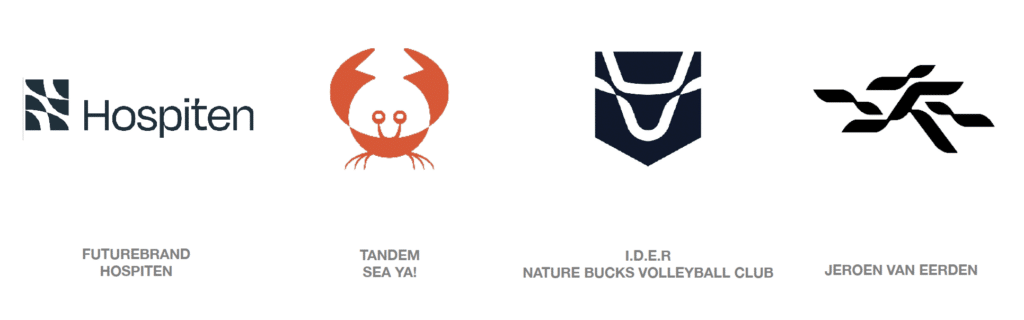
This year, 30,000+ logos from over 120 countries were analyzed. From brand mascots to melting letterforms and the return of 90s-style press-on type, the overarching insight is clear:
Design is moving toward emotional resonance and energetic motion, not just decoration.
There’s a push to connect, to move, and to tell stories with clarity (even if it comes in the form of a smirking snack mascot with rubbery legs).
2025’s Standout Logo Trends
Here’s your digestible breakdown of the most relevant shifts.
1. Smokies

Soft, rounded joins and router-style curves mimic the friendly imperfection of hand-carved signs. It’s digital design trying to feel human. Expect these in wellness, lifestyle, and conscious consumer brands.
 2. Sharps

Freeform cuts that resolve into refined tension. Think rebellious, but smart. These logos slice convention while keeping visual harmony — and they feel especially at home in tech and creative industries wanting edge with precision.
 3. Scalers

A literal visual metaphor for growth. Using stepped or expanding shapes, these logos sell ambition and momentum — perfect for startups, enterprise SaaS, or anyone scaling fast and proud.
 4. Frilberry

Think cottagecore meets identity design. Leafy embellishments and organic frills wrap modern logos in a pastoral aesthetic. A strong contender in food, wellness, and indie fashion spaces.
 5. Crossovers
Twisting ribbons, intersecting planes, and flowing geometry that signals flexibility, agility, and connection. These are visual shapeshifters — powerful for brands navigating multiple audiences or hybrid offerings.
 6. Squared

The humble square returns, not as a filler but as the hero. A counterweight to the chaos, this trend speaks to trust, longevity, and grounded simplicity. Often paired with monograms and structural systems.
 7. Typemelts

Ligature chaos meets clever glue. Letters fuse awkwardly, melting into each other like magnetic blobs. Great for brands chasing cool, “disruptive” or Gen Z aesthetics.
 8. LongLegs

Stretched type and elastic letterforms pull logos into architectural spaces. These monograms move with intention — often animated, always visually arresting.
 9. BlurTails

Logo as motion trail. These marks look like they’ve already moved on — literally. Gradient fades, soft vapor paths, and directional cues all create a sense of dynamic momentum.
 10. PolyGrid

Aesthetic anarchy within order. Logos using uniform grid systems, but swapping in diverse shapes to highlight individuality within structure. Great metaphor for community-driven brands or modular identity systems.
 11. SpinShift

Rotational gradients, fanned elements, and logo systems that mimic dials and modulation. This is control-as-aesthetic, ideal for tech, SaaS, and any brand that flexes with purpose.
 12. Sprinklers & Droplets

Water gets its moment. From gentle droplets to edge-patterned icons, these symbols are less about hydration and more about energy in motion. Nature, health, and tech brands alike are using this to express sustainability and action.
 13. Hoopty

Logos that orbit. These use rotational forms and celestial cues to signify exploration, navigation, and movement across dimensions — metaphorically and literally.
But Wait… There’s a Mascot Renaissance
Mascots are everywhere in 2025.
From kawaii 3D renders to illustrated woodland creatures, brands are leaning hard into personality and charm. Why? Because amidst the rise of AI, what we crave is connection.
Mascots break the grid. They make us smile. They add narrative. They’re the human face of increasingly faceless tech.
This isn’t a gimmick. It’s emotional branding — and it’s working.
Where AI Fits In (And Where It Doesn’t)
AI has gifted us an explosion of visual ideas — sometimes too many. The key isn’t the generation. It’s the editing.
The best logos this year didn’t scream “AI-made.” They were refined, meaningful, and restrained. The craft still counts — perhaps more than ever.
TL;DR — 2025 in One Sentence
Logo design in 2025 is about warmth, movement, and clarity — built with restraint, shaped by intention, and ready to connect on both micro and cosmic levels.
Want more?
 Want more? Tune into our JUST Branding episode with Bill Gardner where we go beyond the trends and talk logos vs brands — and why they’re not the same thing.
LogoLounge is where thousands of designers worldwide connect, share, and find inspiration. Members gain unlimited access to nearly 450,000 searchable, contextualized logos — and can upload unlimited work for consideration in the next LogoLounge book — all for an annual membership of $100.
And exciting news: judging for LogoLounge Book 15 has just wrapped (and I was a judge this year), and the newest industry bible of logo design will hit shelves by the end of the year.
Join the global community shaping what’s next in logo design.
Want more? Check out our JUST Branding episode with Bill Gardner, where we go deeper than design trends and unpack the difference between logos and brands — and why that distinction matters more than ever.
LogoLounge is where thousands of designers around the world connect, share, and stay inspired. Members get unlimited access to nearly 450,000 searchable logos, plus the ability to upload their own work for a chance to be featured in the next LogoLounge book — all for just $100/year.
And some exciting news: judging for LogoLounge Book 15 just wrapped — and I was one of the judges this year. The newest volume in the logo design canon is set to drop by the end of the year.
Final Take
As always: these trends aren’t rules. They’re signals. Tools. Vibes.
Use them to inform, inspire, and sharpen your strategic eye, but don’t chase them blindly.