When I first started messing around with code, rounded corners required five background images or an image sprite likely created in Photoshop, so when border-radius came onto the scene, I remember everybody thinking that it was the best thing ever. Web designs were very square at the time, so to have border-radius was super cool, and it saved us a lot of time, too.
Chris’ border-radius article from 2009, which at the time of writing is 16 years old (wait, how old am I?!), includes vendor prefixes for older web browsers, including “old Konqueror browsers” (-khtml-border-radius). What a time to be alive!
We’re much less excited about rounded corners nowadays. In fact, sharp corners have made a comeback and are just as popular now, as are squircles (square-ish circles or circle-y squares, take your pick), which is exactly what the corner-shape CSS property enables us to create (in addition to many other cool UI effects that I’ll be walking you through today).
At the time of writing, only Chrome 139 and above supports corner-shape, which must be used with the border-radius property or/and any of the related individual properties (i.e., border-top-left-radius, border-top-right-radius, border-bottom-right-radius, and border-bottom-left-radius):
Snipped corners using corner-shape: bevel
These snipped corners are becoming more and more popular as UI designers embrace brutalist aesthetics.
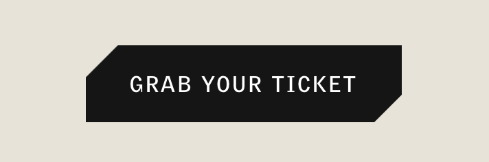
In the example above, it’s as easy as using corner-shape: bevel for the snipped corners effect and then border-bottom-right-radius: 16px for the size.
corner-shape: bevel;
border-bottom-right-radius: 16px;
We can do the same thing and it really works with a cyberpunk aesthetic:
Slanted sections using corner-shape: bevel
Slanted sections is a visual effect that’s even more popular, probably not going anywhere, and again, helps elements to look a lot less like the boxes that they are.
Before we dive in though, it’s important to keep in mind that each border radii has two semi-major axes, a horizontal axis and a vertical axis, with a ‘point’ (to use vector terminology) on each axis. In the example above, both are set to 16px, so both points move along their respective axis by that amount, away from their corner of course, and then the beveled line is drawn between them. In the slanted section example below, however, we need to supply a different point value for each axis, like this:
corner-shape: bevel;
border-bottom-right-radius: 100% 50px;
The first point moves along 100% of the horizontal axis whereas the second point travels 50px of the vertical axis, and then the beveled line is drawn between them, creating the slant that you see above.
By the way, having different values for each axis and border radius is exactly how those cool border radius blobs are made.
Sale tags using corner-shape: round bevel bevel round
You’ve see those sale tags on almost every e-commerce website, either as images or with rounded corners and not the pointy part (other techniques just aren’t worth the trouble). But now we can carve out the proper shape using two different types of corner-shape at once, as well as a whole set of border radius values:

You’ll need corner-shape: round bevel bevel round to start off. The order flows clockwise, starting from the top-left, as follows:
- top-left
- top-right
- bottom-right
- bottom-left
Just like with border-radius. You can omit some values, causing them to be inferred from other values, but both the inference logic and resulting value syntax lack clarity, so I’d just avoid this, especially since we’re about to explore a more complex border-radius:
corner-shape: round bevel bevel round;
border-radius: 16px 48px 48px 16px / 16px 50% 50% 16px;
Left of the forward slash (/) we have the horizontal-axis values of each corner in the order mentioned above, and on the right of the /, the vertical-axis values. So, to be clear, the first and fifth values correspond to the same corner, as do the second and sixth, and so on. You can unpack the shorthand if it’s easier to read:
border-top-left-radius: 16px;
border-top-right-radius: 48px 50%;
border-bottom-right-radius: 48px 50%;
border-bottom-left-radius: 16px;
Up until now, we’ve not really needed to fully understand the border radius syntax. But now that we have corner-shape, it’s definitely worth doing so.
As for the actual values, 16px corresponds to the round corners (this one’s easy to understand) while the 48px 50% values are for the bevel ones, meaning that the corners are ‘drawn’ from 48px horizontally to 50% vertically, which is why and how they head into a point.
Regarding borders — yes, the pointy parts would look nicer if they were slightly rounded, but using borders and outlines on these elements yields unpredictable (but I suspect intended) results due to how browsers draw the corners, which sucks.
Arrow crumbs using the same method
Yep, same thing.

We essentially have a grid row with negative margins, but because we can’t create ‘inset’ arrows or use borders/outlines, we have to create an effect where the fake borders of certain arrows bleed into the next. This is done by nesting the exact same shape in the arrows and then applying something to the effect of padding-right: 3px, where 3px is the value of the would-be border. The code comments below should explain it in more detail (the complete code in the Pen is quite interesting, though):
ol {
  /* Clip n’ round */
  overflow: clip;
  border-radius: 16px;

  li {
    /* Arrow color */
    background: hsl(270 100% 30%);

    /* Reverses the z-indexes, making the arrows stack */
    /* Result: 2, 1, 0, ... (sibling-x requires Chrome 138+) */
    z-index: calc((sibling-index() * -1) + sibling-count());

    &:not(:last-child) {
      /* Arrow width */
      padding-right: 3px;

      /* Arrow shape */
      corner-shape: bevel;
      border-radius: 0 32px 32px 0 / 0 50% 50% 0;

      /* Pull the next one into this one */
      margin-right: -32px;

    }

    a {
      /* Same shape */
      corner-shape: inherit;
      border-radius: inherit;

      /* Overlay background */
      background: hsl(270 100% 50%);
    }
  }
}
Tooltips using corner-shape: scoop
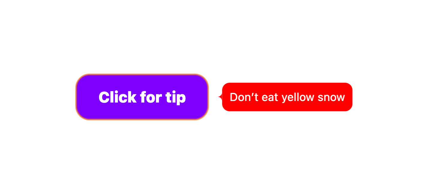
To create this tooltip style, I’ve used a popover, anchor positioning (to position the caret relative to the tooltip), and corner-shape: scoop. The caret shape is the same as the arrow shape used in the examples above, so feel free to switch scoop to bevel if you prefer the classic triangle tooltips.
A quick walkthrough:
Don’t eat yellow snow
#tooltip {
  /* Define anchor */
  anchor-name: --tooltip;

  /* Necessary reset */
  margin: 0;

  /* Center vertically */
  align-self: anchor-center;

  /* Pin to right side + 15 */
  left: calc(anchor(right) + 15px);

  &::after {
    /* Create caret */
    content: "";
    width: 5px;
    height: 10px;
    corner-shape: scoop;
    border-top-left-radius: 100% 50%;
    border-bottom-left-radius: 100% 50%;

    /* Anchor to tooltip */
    position-anchor: --tooltip;

    /* Center vertically */
    align-self: anchor-center;

    /* Pin to left side */
    right: anchor(left);

    /* Popovers have this already (required otherwise) */
    position: fixed;
  }
}
If you’d rather these were hover-triggered, the upcoming Interest Invoker API is what you’re looking for.
Realistic highlighting using corner-shape: squircle bevel
The element, used for semantic highlighting, defaults with a yellow background, but it doesn’t exactly create a highlighter effect. By adding the following two lines of CSS, which admittedly I discovered by experimenting with completely random values, we can make it look more like a hand-waved highlight:
mark {
  /* A...squevel? */
  corner-shape: squircle bevel;
  border-radius: 50% / 1.1rem 0.5rem 0.9rem 0.7rem;

  /* Prevents background-break when wrapping */
  box-decoration-break: clone;
}
We can also use squircle by itself to create those fancy-rounded app icons, or use them on buttons/cards/form controls/etc. if you think the ‘old’ border radius is starting to look a bit stale:


Hand-drawn boxes using the same method
Same thing, only larger. Kind of looks like a hand-drawn box?
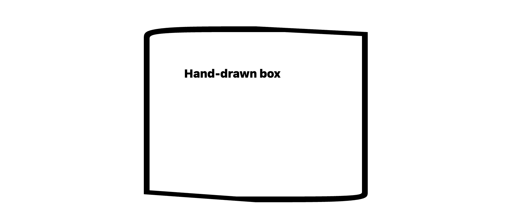
Admittedly, this effect doesn’t look as awesome on a larger scale, so if you’re really looking to wow and create something more akin to the Red Dead Redemption aesthetic, this border-image approach would be better.
Clip a background with corner-shape: notch
Notched border radii are ugly and I won’t hear otherwise. I don’t think you’ll want to use them to create a visual effect, but I’ve learned that they’re useful for background clipping if you set the irrelevant axis to 50% and the axis of the side that you want to clip by the amount that you want to clip it by. So if you wanted to clip 30px off the background from the left for example, you’d choose 30px for the horizontal axes and 50% for the vertical axes (for the -left-radius properties only, of course).
corner-shape: notch;
border-top-left-radius: 30px 50%;
border-bottom-left-radius: 30px 50%;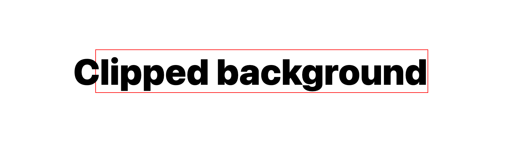
Conclusion
So, corner-shape is actually a helluva lot of fun. It certainly has more uses than I expected, and no doubt with some experimentation you’ll come up with some more. With that in mind, I’ll leave it to you CSS-Tricksters to mess around with (remember though, you’ll need to be using Chrome 139 or higher).
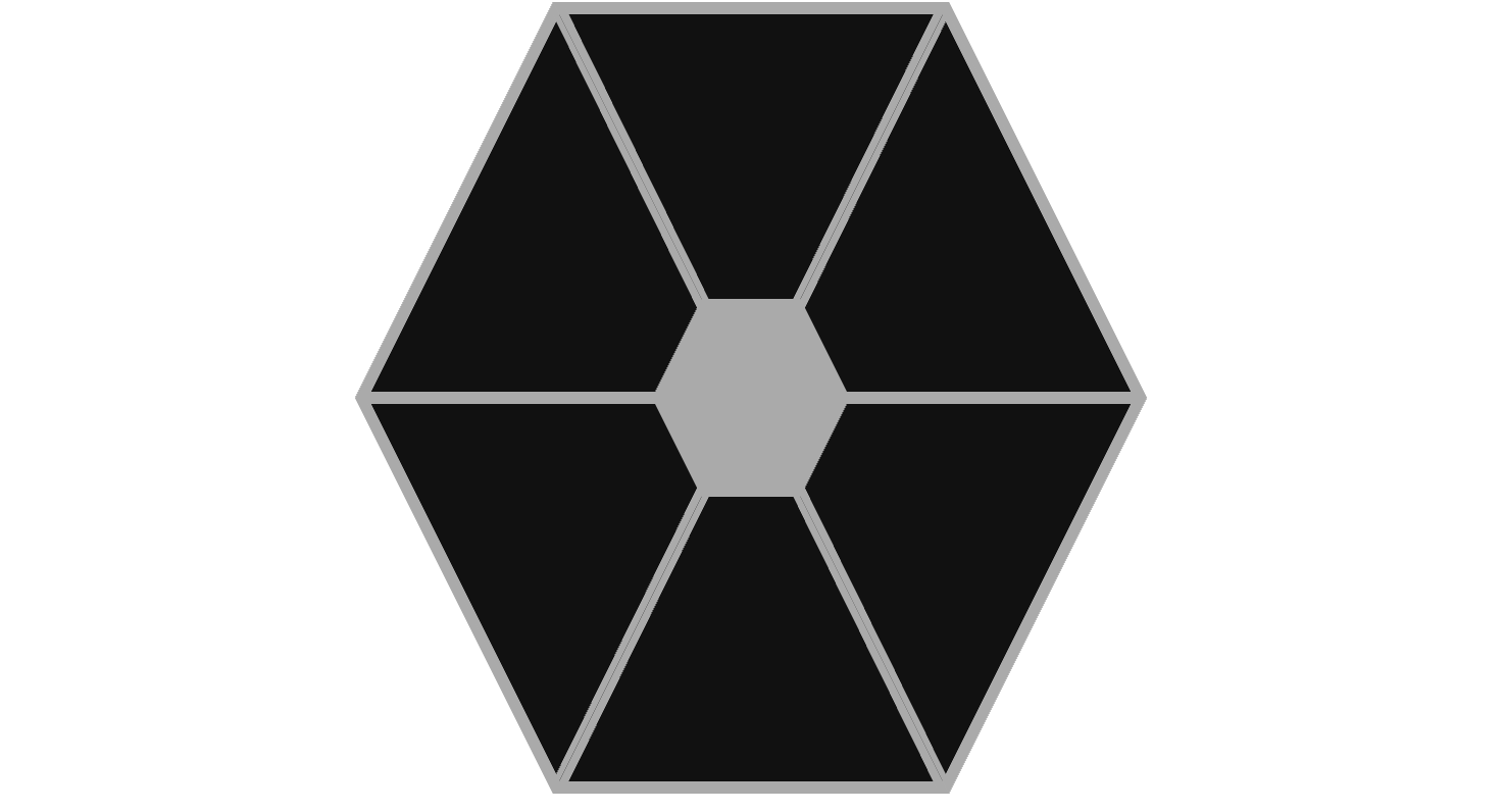
As a parting gift, I leave you with this very cool but completely useless CSS Tie Fighter, made with corner-shape and anchor positioning: